


The global warming - also called "Climate Change" even if it must physically begin with a warming - is a key topic and therefore it is interesting to follow earth's average temperature. While I am fully unqualified to explain anything about climate (I am a chemical engineer), I will also play a bit with the data - just a game, no serious previsions there!
Interestingly, it is not at all obvious to answer the basic question: what is the temperature on earth? While we can ponctually measure temperature very precisely, we can only guess the temperatures at locations where no thermometer is - right now - measuring.
Earth not being covered by thermometers, there is some form of uncertainty on the data. Several scientific efforts are made to get an approximate measure of the average temperature on earth. Two are mostly based on weather stations and ocean buoys (GISS from the NASA in the US and HADCRUT3 from UEA and MetOffice in the UK). The other two are based on satellite measurements (UAH and RSS, both in the US).
Thanks to the excellent online plotter at Wood for Trees, we can view easily those for data and correct some differences (all data are reporting a difference of temperature from an average of several years. As those reference years vary, so do the absolute values reported. Hence a necessary offset. Note that this does not impact the trends).
Let's begin with the corrected raw data:

Fig. 1: Raw temperature data 1910-present, monthly
We can see that based on those data, the fit between methods is quite good. The picture must therefore not be fully wrong.
The first simplification is to remove the seasonal changes by averaging all the months in each year. We can then add "cosmetic" trendlines - obviously the choices of the start and end points are critical for trendlines, so these trendlines are not to be taken as a serious estimate of the rate of temperature changes!
Finally we can add a known cycle as well (light blue) just to see if it fits: the solar activity, as represented by the number of sunspots in a given month. Note that this plot is qualitative (scale, offset chosen for positioning only).

Fig. 2: Temperature data 1910-present, yearly
The solar cycle seems to impact the temperature indeed. So now we can remove the sun oscillations by averaging 11 years (the approximate sun cycle) together.
The average on 11 years does significantly reduce the range of data for satellites, as the first 5.5 years and the final 5.5 years are not shown (reducing 30 years of measures to only 20 years). This is why this plot stops in 2004 and hence don't show the plateau since 2000 very clearly. In order to show this, I spliced the annual averages of the HADCRUT for the last 11 years. Finally to get the longest possible snapshop, all historical data are included since 1860.

Fig. 3: Temperature data 1850-present, running mean on 132 months (11-year solar cycles)
And this last graph is more or less plotting the history of earth's temperature since it is measured. Note the growing dicrepency between the HADCRUT3 and GISTEMP datasets for older data (before 1920) - this indicates that older data where sparser measurements exist are much less trustworthy.
It would be of course interesting to go much further in the past, such measured data begin at the earliest around 1850 with a coverage that allow making an "earth average". To go further in the past require using "proxies", i.e. indirect indicators such as tree rings (more growth if warm, therefore measuring the rings give an indication of the temperature) which are much more subject to caution (do tree really grow more if it is warm but very dry? the signal correlates imperfectly to temperatures).
The actual history released by IPCC is more or less a relatively low variability betwenn -1C and 0C, and then an increase to +0.5C since 1970. See the plot.
On wikipedia, there is a nice plot summarizing several studies (click on the plot for the sources):
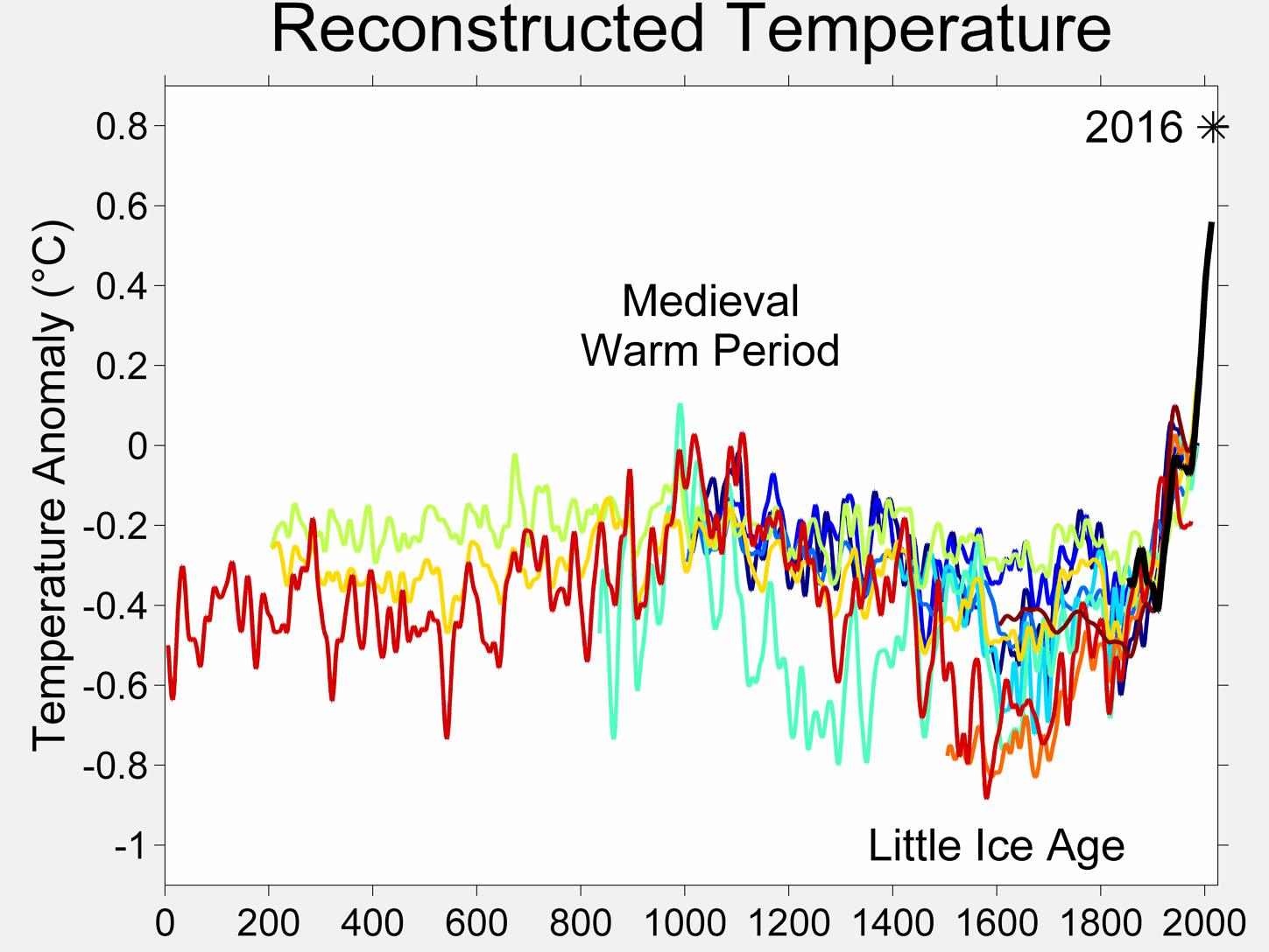
Fig. 4: Paleotemperatures, results of several studies
I must here specify that because not so many proxies are available, several studies may be based on the same proxies and hence if those key proxies are subject to question (e.g. small growth of the tree because albeight warm it was too dry), then most of the data is questionable. So such plots are not the Truth, but the best approximate as of today.
Going back to the measured history plot since 1850, we can see apparently a 60 year cycle - 30 years of heating, 30 years of cooling:
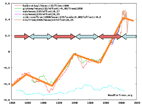
Fig. 5: Illustration of the apparent 60-years cycle
Apparently, this cycle could be PDO or Pacific Decadal Oscillation. That's over my head, so let's just cancel it...
Cancelling these cycles (i.e. averaging on 60 years or 720 months!) implies reducing massively the length of the plot - and can only be applied on the "long" data from GISS and HADCRUT.
The blue lines are indicative 11-year averages to show further data; they do not continue the trend as they are shorter than the cycle and should therefore not be interpreted as a massive sudden acceleration/deceleration of the trends:

Fig. 6: Temperatures 1850-present averaged on 60 years (720 months)
What we see is an almost constant temperature increase in the GISS data, while HADCRUT shows a minimum in the early data - rember this difference is certainly an artefact as GISS data begins almost 1/2 cycle (30 years) after HADCRUT. The slope is appromximately 0.53C/century. The cycle last ca. 60 years, and we have 150 years of data - or 2.5 cycle. This means a potential error in the slope (we may measure 3 cooling phases and 2 heating phases or the opposite, for instance - or exactly 2.5 heating and 2.5 cooling). This error may be as high as +/-50%, or between 0.3C and 0.8C per century!
This rate seems to be slightly increasing over time. This is not yet very visible in the GISS, but more in the HADCRUT.
For the sun, I chose to average 30 years together only. This is arbitrary but highlights the rather high activity of the sun in the second half of the century - note that the scale and position are also arbitrary, the real values are an average of 40 in the early century and 80 in the late century, so a rough doubling of sunspots
The long term historical plot showed us that there have been apparently rather strong natural variations of the climate, even if on the proxies they seem slower than our 0.5C per century. But 0.2-0.3C/century is e.g. shown by the red curve between 1400 and 1600, so 0.5C is not "orders of magnitude" different.
The increase is already marked at the beginning of the century. We can check the amount of CO2 released by anthropogenic activities, as approximated by the sum of all emissions due to fossil energy emissions (that does not include everything relevant to greenhouse effect - for instance no deforestation or no methane emissions due to cattles - but is a simple early approximation of anthropogenic effects):
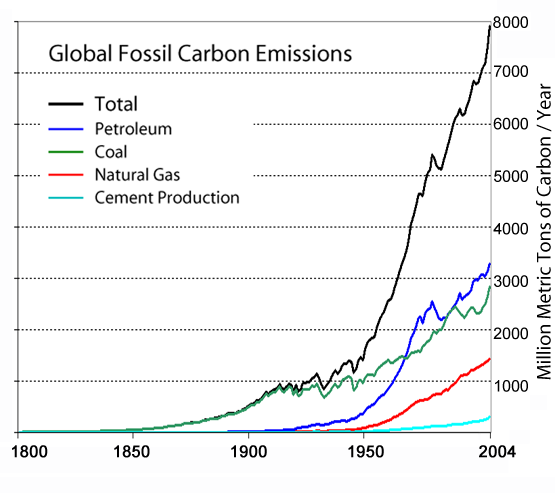
Fig. 7: Global anthropogeneous carbon emissions
We see that by 1950, the sum of antropological release of CO2 is less than 20% of the total release until 2000 - or in other words, we released 4 to 5 times more in the second part of the 20th century than in the first part.
So, enough background info.
The rest of this text will try to intrepret these past temperature and to extrapolate in the future. Two very important comments are therefore:
Example: You walk at night (i.e. see nothing) and you are climbing since 1 hour on a hill - i.e. each step of the past hour was upwards. What will be the next step? Up or downwards? The best thing to do (the safest) is to wait for daylight to understand the system (or finance a research effort) - but let's assume you cannot wait. You cannot know the answer, but statistically you should bet on uphill. Because assuming a simple hill like a conus, every step will be uphill, and then a single step (on the top) will break the rule, and then every step will be downhill (new rule as extrapolated from the new situation). So if you have N steps (N>1), N-1 will follow past trend, and only 1 will break it. If you walk 1km, that makes odds of 99.9% that the next step is inline with the past in our simplistic example.
Therefore we agree that the best is to finance more research to actualy understand the system. But if we cannot wait, we can still play the game and try to draw some extrapolations...
A possible interpretation is the following:
So after the next 20 years of approximate "flat" temperatures, taking the squared model... we get an increase of 1.1C until 2100. By then I'll update my website with more predictions!
Am I sure enough to put my money where my mouth is? Nope.
Inbetween, let's take reasonable actions against anthropogeneous global warming - this is not the topic of this text, but eventually we need to change our economy anyway because the oil is limited, so whatever the impact on climate, acting today to develop renewable energies is a good investment on the long term! And let's follow the trends on Fig. 9 zooming on the most recent 20 years and updated regularly (when new data are released) by the provider.

Fig. 9: Temperature data 1990-present, yearly
Note:
Note that recent plots have been released (Copenhaven Diagnosis) and seem to indicate a monotoning increase without the plateau in the XXIst century - this is strange and would contradict the other measurements (and even released data from their sources) and hence should be confirmed.
Model Details:
The models are based on (x is the year, y the temperature anomaly):
a) a sinusoid: y1 = 0.12*sin((x-1865)*2pi/60 (3 degrees of freedom: period, amplitude, phase)
b) a linear trend: y2 = 0.005*(x-1860)-0.5 (2 degrees of freedom: slope, origin)
c) a squared equation: y3 = 0.000034*(x-1860)^2-0.4 (2 degrees of freedom: slope and origin)
d) an exponential trend: y4 = 0.15*exp((x-1860)*0.012)-0.55 (3 degrees of freedom: origin, slope, exponent)
The final linear model is: y = 1.2*y1 + y2 (5 degrees of freedom)
The final squared model is: y = 1.15*y1 + y3 (5 degrees of freedom)
The final exponential model is: y = y1 + y4 (6 degrees of freedom)
Give me enough degrees of freedom, and I'll fit you an elephant. All the parameters are set manually to obtain visually a good fit. No real fitting (such as least square) methods have been used and that may make huge differences in extrapolations! See below an example of slightly different parameters that visually fits also quite well and see the extrapolation explode to +3.5C! Therefore do not use those equations for anything serious!
"Legal" Note:
The aim of this page is only to investigate temperature trends, and not at all to pretend explaining anything or pretending to know better than the climate specialists with regards to global warming - I am not qualified for that and my analysis may well miss the point, for example because the 60 year averages is too long to already see a signal when CO2 emissions en-masse are only 60 years old or so. Or because of delays and inerty of the (rather large) Earth's climate system. There may also be climatic tipping points that suddenly changes the way the system respond and by definition render history-based analysis invalid... So don't draft policy based on this text - or at least don't blame me if it fails miserably!
Be the first to comment!
Leave a comment:
Interestingly, it is not at all obvious to answer the basic question: what is the temperature on earth? While we can ponctually measure temperature very precisely, we can only guess the temperatures at locations where no thermometer is - right now - measuring.
Earth not being covered by thermometers, there is some form of uncertainty on the data. Several scientific efforts are made to get an approximate measure of the average temperature on earth. Two are mostly based on weather stations and ocean buoys (GISS from the NASA in the US and HADCRUT3 from UEA and MetOffice in the UK). The other two are based on satellite measurements (UAH and RSS, both in the US).
Thanks to the excellent online plotter at Wood for Trees, we can view easily those for data and correct some differences (all data are reporting a difference of temperature from an average of several years. As those reference years vary, so do the absolute values reported. Hence a necessary offset. Note that this does not impact the trends).
Let's begin with the corrected raw data:
Fig. 1: Raw temperature data 1910-present, monthly
We can see that based on those data, the fit between methods is quite good. The picture must therefore not be fully wrong.
The first simplification is to remove the seasonal changes by averaging all the months in each year. We can then add "cosmetic" trendlines - obviously the choices of the start and end points are critical for trendlines, so these trendlines are not to be taken as a serious estimate of the rate of temperature changes!
Finally we can add a known cycle as well (light blue) just to see if it fits: the solar activity, as represented by the number of sunspots in a given month. Note that this plot is qualitative (scale, offset chosen for positioning only).
Fig. 2: Temperature data 1910-present, yearly
The solar cycle seems to impact the temperature indeed. So now we can remove the sun oscillations by averaging 11 years (the approximate sun cycle) together.
The average on 11 years does significantly reduce the range of data for satellites, as the first 5.5 years and the final 5.5 years are not shown (reducing 30 years of measures to only 20 years). This is why this plot stops in 2004 and hence don't show the plateau since 2000 very clearly. In order to show this, I spliced the annual averages of the HADCRUT for the last 11 years. Finally to get the longest possible snapshop, all historical data are included since 1860.
Fig. 3: Temperature data 1850-present, running mean on 132 months (11-year solar cycles)
And this last graph is more or less plotting the history of earth's temperature since it is measured. Note the growing dicrepency between the HADCRUT3 and GISTEMP datasets for older data (before 1920) - this indicates that older data where sparser measurements exist are much less trustworthy.
It would be of course interesting to go much further in the past, such measured data begin at the earliest around 1850 with a coverage that allow making an "earth average". To go further in the past require using "proxies", i.e. indirect indicators such as tree rings (more growth if warm, therefore measuring the rings give an indication of the temperature) which are much more subject to caution (do tree really grow more if it is warm but very dry? the signal correlates imperfectly to temperatures).
The actual history released by IPCC is more or less a relatively low variability betwenn -1C and 0C, and then an increase to +0.5C since 1970. See the plot.
On wikipedia, there is a nice plot summarizing several studies (click on the plot for the sources):

Fig. 4: Paleotemperatures, results of several studies
I must here specify that because not so many proxies are available, several studies may be based on the same proxies and hence if those key proxies are subject to question (e.g. small growth of the tree because albeight warm it was too dry), then most of the data is questionable. So such plots are not the Truth, but the best approximate as of today.
Going back to the measured history plot since 1850, we can see apparently a 60 year cycle - 30 years of heating, 30 years of cooling:
Fig. 5: Illustration of the apparent 60-years cycle
Apparently, this cycle could be PDO or Pacific Decadal Oscillation. That's over my head, so let's just cancel it...
Cancelling these cycles (i.e. averaging on 60 years or 720 months!) implies reducing massively the length of the plot - and can only be applied on the "long" data from GISS and HADCRUT.
The blue lines are indicative 11-year averages to show further data; they do not continue the trend as they are shorter than the cycle and should therefore not be interpreted as a massive sudden acceleration/deceleration of the trends:
Fig. 6: Temperatures 1850-present averaged on 60 years (720 months)
What we see is an almost constant temperature increase in the GISS data, while HADCRUT shows a minimum in the early data - rember this difference is certainly an artefact as GISS data begins almost 1/2 cycle (30 years) after HADCRUT. The slope is appromximately 0.53C/century. The cycle last ca. 60 years, and we have 150 years of data - or 2.5 cycle. This means a potential error in the slope (we may measure 3 cooling phases and 2 heating phases or the opposite, for instance - or exactly 2.5 heating and 2.5 cooling). This error may be as high as +/-50%, or between 0.3C and 0.8C per century!
This rate seems to be slightly increasing over time. This is not yet very visible in the GISS, but more in the HADCRUT.
For the sun, I chose to average 30 years together only. This is arbitrary but highlights the rather high activity of the sun in the second half of the century - note that the scale and position are also arbitrary, the real values are an average of 40 in the early century and 80 in the late century, so a rough doubling of sunspots
The long term historical plot showed us that there have been apparently rather strong natural variations of the climate, even if on the proxies they seem slower than our 0.5C per century. But 0.2-0.3C/century is e.g. shown by the red curve between 1400 and 1600, so 0.5C is not "orders of magnitude" different.
The increase is already marked at the beginning of the century. We can check the amount of CO2 released by anthropogenic activities, as approximated by the sum of all emissions due to fossil energy emissions (that does not include everything relevant to greenhouse effect - for instance no deforestation or no methane emissions due to cattles - but is a simple early approximation of anthropogenic effects):

Fig. 7: Global anthropogeneous carbon emissions
We see that by 1950, the sum of antropological release of CO2 is less than 20% of the total release until 2000 - or in other words, we released 4 to 5 times more in the second part of the 20th century than in the first part.
So, enough background info.
The rest of this text will try to intrepret these past temperature and to extrapolate in the future. Two very important comments are therefore:
- Correlation is not causation. It is not correct to draw hypothesis based solely on trends (see e.g. here for spurious use of statistics) when not having at least good hypothesis on the underlying physical phenomena,
- Such extrapolations are based on the principle that what happened in the past will continue unmodified in the future. This is obviously sometimes wrong. When you climb on a hill, at some point you will reach the top and your next step will be downwards instead of upwards. Historic temperatures as shown on Fig. 4 show natural variations going up and down - and no monotoneous increase or decrease.
Example: You walk at night (i.e. see nothing) and you are climbing since 1 hour on a hill - i.e. each step of the past hour was upwards. What will be the next step? Up or downwards? The best thing to do (the safest) is to wait for daylight to understand the system (or finance a research effort) - but let's assume you cannot wait. You cannot know the answer, but statistically you should bet on uphill. Because assuming a simple hill like a conus, every step will be uphill, and then a single step (on the top) will break the rule, and then every step will be downhill (new rule as extrapolated from the new situation). So if you have N steps (N>1), N-1 will follow past trend, and only 1 will break it. If you walk 1km, that makes odds of 99.9% that the next step is inline with the past in our simplistic example.
Therefore we agree that the best is to finance more research to actualy understand the system. But if we cannot wait, we can still play the game and try to draw some extrapolations...
A possible interpretation is the following:
- There is a temperature increase since 1850 at least. Probably longer even as illustrated by Fig. 4.
- This temperature increase must be partly due to "natural" reasons independant from the industrialization and CO2, because otherwise the trend would not show already at significant values before the beginning of the century. This is valid even in case of long delays in the system, and even more so in case of strong feedbacks. There is apparently a "natural" heating taking place.
- The temperature increase is apparently accelerating. See Fig 5: each 30-year increase period is higher than the preceding one.
- Pending more knowledge, we can assume that the acceleration is caused by the undisputable greenhouse effect due to the anthropogenic CO2 (indisputable because while we can discuss about the magnitude of the effect, the existence of the effect is absolutely proven beyond any doubt). Other factors may play also a role, such as the sun intensity, as measured by sunspots, assuming a long latency (however scientists assert that sunspots have a too small influence).
- The "two points" that we have (only two complete cycles of 60 years) do not allow yet to say something serious about the rate of rate increase (i.e. second derivative of the temperature) as you can fit any curve through two points.
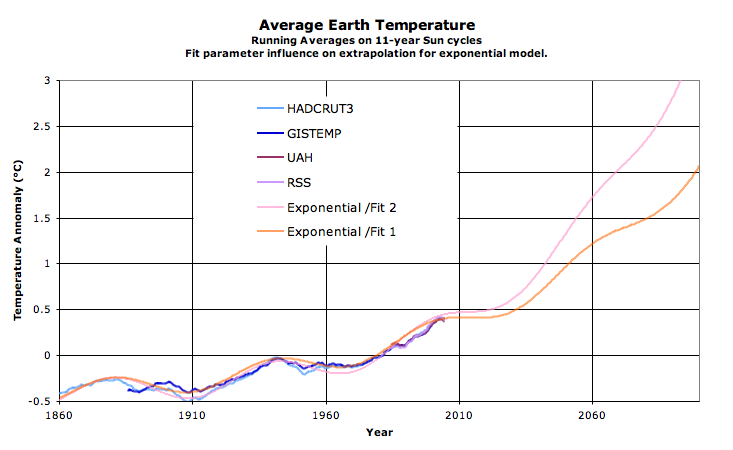
One extreme alternative is to assume a constant increase (i.e. assume the apparent acceleration to be an artefact of too short measurements). A median alternative is to assume a linear increase in rate, hence a squared fit for the temperature (whose derivative is linear). The final extreme alternative is to fit an exponential temperature increase (i.e. the derivative or rate of increase is also exponential). Each one lead to different fit qualities, and to different extrapolations:
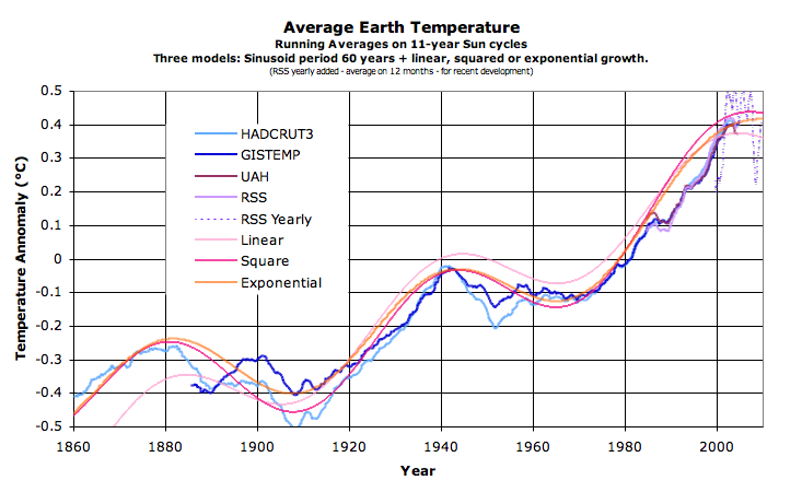
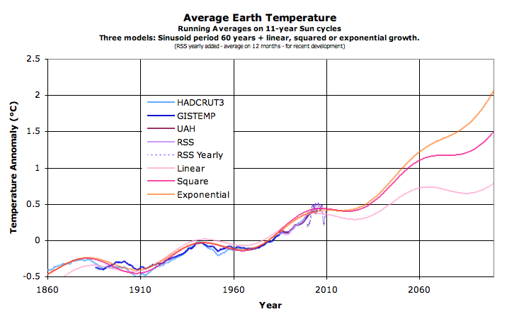
Fig. 8a: Temperature-evolution "models" (qualitative); Fig. 8b: Extrapolations (qualitative)
- If linearily extrapolating, it leads to an anomaly of +0.75 in 2060 and then ca +0.8 in 2100 (mostly another cooling period 2060-2090). So a conservative guess is 0.4C more than today in 2100.
- If extrapolating with a linear derivative, i.e. with a squared function, the anomaly in 2060 is 1.1C, and 2100 reaches 1.5C, a difference with today of 1.1C. The difference with the linear model (0.7C in 2100) is for instance the probable anthropogenic contribution.
- If exponentially extrapolating, we can expect for instance an anomaly of 1.2C in 2060 and a whopping 2.1C in 2100. Or about 1.7C warmer than today. The difference with the linear model (ca. 1.3C) being the possble anthropogenic contribution. Note that only slight changes of parameters can change dramatically the forecasts - see model details below.
- Or there is a large feedback somewhere coupled with delays and your guess can be as high as you want.
So after the next 20 years of approximate "flat" temperatures, taking the squared model... we get an increase of 1.1C until 2100. By then I'll update my website with more predictions!
Am I sure enough to put my money where my mouth is? Nope.
Inbetween, let's take reasonable actions against anthropogeneous global warming - this is not the topic of this text, but eventually we need to change our economy anyway because the oil is limited, so whatever the impact on climate, acting today to develop renewable energies is a good investment on the long term! And let's follow the trends on Fig. 9 zooming on the most recent 20 years and updated regularly (when new data are released) by the provider.
Fig. 9: Temperature data 1990-present, yearly
Note:
Note that recent plots have been released (Copenhaven Diagnosis) and seem to indicate a monotoning increase without the plateau in the XXIst century - this is strange and would contradict the other measurements (and even released data from their sources) and hence should be confirmed.
Model Details:
The models are based on (x is the year, y the temperature anomaly):
a) a sinusoid: y1 = 0.12*sin((x-1865)*2pi/60 (3 degrees of freedom: period, amplitude, phase)
b) a linear trend: y2 = 0.005*(x-1860)-0.5 (2 degrees of freedom: slope, origin)
c) a squared equation: y3 = 0.000034*(x-1860)^2-0.4 (2 degrees of freedom: slope and origin)
d) an exponential trend: y4 = 0.15*exp((x-1860)*0.012)-0.55 (3 degrees of freedom: origin, slope, exponent)
The final linear model is: y = 1.2*y1 + y2 (5 degrees of freedom)
The final squared model is: y = 1.15*y1 + y3 (5 degrees of freedom)
The final exponential model is: y = y1 + y4 (6 degrees of freedom)
Give me enough degrees of freedom, and I'll fit you an elephant. All the parameters are set manually to obtain visually a good fit. No real fitting (such as least square) methods have been used and that may make huge differences in extrapolations! See below an example of slightly different parameters that visually fits also quite well and see the extrapolation explode to +3.5C! Therefore do not use those equations for anything serious!
"Legal" Note:
The aim of this page is only to investigate temperature trends, and not at all to pretend explaining anything or pretending to know better than the climate specialists with regards to global warming - I am not qualified for that and my analysis may well miss the point, for example because the 60 year averages is too long to already see a signal when CO2 emissions en-masse are only 60 years old or so. Or because of delays and inerty of the (rather large) Earth's climate system. There may also be climatic tipping points that suddenly changes the way the system respond and by definition render history-based analysis invalid... So don't draft policy based on this text - or at least don't blame me if it fails miserably!
Comments
Be the first to comment!
Leave a comment: